So I was scrolling through my kid's iPad yesterday (don't judge me, sometimes you gotta check what they're up to) when I noticed something odd about the Roblox icon. That familiar logo wasn't grey anymore – it was BLUE. Like, aggressively blue. The kind of blue that makes you wonder if your eyes are playing tricks on you.
My 9-year-old didn't even notice until I pointed it out. His response: "Who cares? I just wanna play Adopt Me." Fair enough, kiddo.
The Mystery of teh Blue Takeover
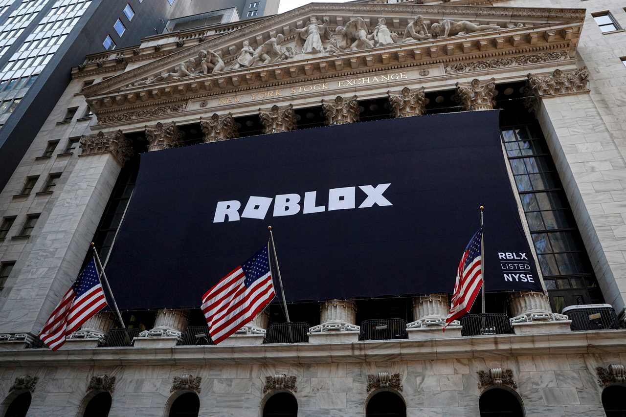
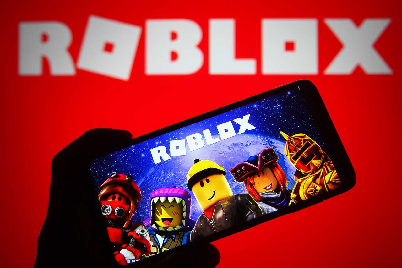
Roblox – that blocky virtual playground where over 70 million people hang out daily – quietly switched from its steely grey logo to this electric blue version. And they didn't even bother announcing it! The website still shows the classic grey-on-black look, but the app icon? Totally blue now.
Nobody at Roblox HQ has bothered explaining why.

This isn't the first time they've played with colors though. Back in the day, they rocked a silver and red combo that honestly looked pretty sweet. I spent way too many hours watching my nephew navigate that interface in 2018 while babysitting him. (He's in high school now and thinks Roblox is "for babies" – how times change.)
When Did This Happen Exactly?
Here's the weird thing – nobody seems to know precisely when this change happened. Some blogger mentioned in March that the logo was still the classic grey and black we all knew. But by April 2025, people started noticing the blue version popping up in the Apple App Store and Google Play.
Actually, this isn't even the first color change this year. Players spotted the play button switching from green to blue back in January.
Is this some kind of slow-motion rebrand? Are they hoping we wouldn't notice if they did it gradually? Listen. We noticed.
What's With Companies and Their Blue Obsession?
Blue is everywhere in tech. Facebook. Twitter (or X or whatever Elon's calling it today). LinkedIn. PayPal. It's like these companies all got together and decided, "Hey, let's all wear the same outfit to the party!"
Marketing people will tell you blue represents trust, safety, and professionalism. The red that Roblox used before? That apparently screams urgency and aggression.
Since most Roblox users are kids (including one who reportedly spent over £1,000 of their parents' money – ouch), maybe they're trying to seem more family-friendly and less... I dunno... angry?
The Fans Are Not Having It
I checked out some Reddit threads about this change, and wow, people are not impressed.
One user wrote: "This one is more corporate, emotionless, boring, and plain." Another straight-up said: "Blue looks ugly. Roblox is becoming worse one step at a time."
Harsh.
But I get it. When you spend hours of your life on a platform, even small changes feel personal. It's like when Instagram changes its layout and suddenly your mom calls you because she "can't find her pictures anymore."
So... What Even IS Roblox Anyway?
For those of you living under a digital rock (no judgment, sometimes I wish I was there with you), Roblox isn't actually a game itself. It's a platform where users create and share their own games. My daughter tried explaining it to me as "like YouTube but for games instead of videos" which... actually makes sense.
Kids love it because most games are free, and they can message their friends while playing. Parents worry about it because, well, they can message strangers too. I've had that conversation with my brother about his kids at least three times last year alone.
The whole thing feels like Minecraft and Lego had a digital baby that then went to business school.
And now that baby is blue.
I'm still not sure if this color change means anything significant or if it's just some designer at Roblox HQ who got bored one afternoon. Either way, the kids will keep playing, the parents will keep worrying about screen time, and life in the blocky universe will go on.
Just... bluer.